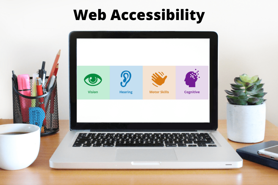
You brought cake for your family party but forgot to bring a vegan cake for Aunt Kara. You tell her, “Sorry, but I guess you can’t have any cake today.” Aunt Kara is upset, and she would think twice before coming to any future family gatherings hosted by you. This is how people with disabilities feel when they visit inaccessible websites. They are invited to a party where they cannot enjoy cake. Making your website accessible for people with disabilities allows for an inclusive experience, allowing them to have their cake and eat it, too. This article will visit basic topics concerning web accessibility and guide you towards charting an inclusive path for your organization.
What does web accessibility mean?
Web accessibility, which is also known as digital accessibility, is a practice that involves removing or preventing any barriers that users may face while accessing or interacting with a web application.
Why should you care about web accessibility?

Did you know that it’s estimated that over 1 billion people around the world have some form of disability? Many people with disabilities often face significant difficulties while performing day-to-day activities. Fortunately, the advent of the internet and the availability of umpteen websites and apps help users with disabilities to perform their tasks easily. However, if websites and apps are not accessible, they are just becoming a part of the problem rather than the solution.
An accessible website helps create an all-inclusive environment where all users have equal access to information and functionality.
Here are some benefits of having an accessible website
- Enhanced user experience
- Broadens your audience reach
- Boosts your SEO
- Builds positive PR
- Protects you against accessibility lawsuits
How is web accessibility enforced?

Now that you understand why web accessibility is important, the next step is to understand who enforces or manages web accessibility.
The World Wide Consortium or W3C is an internet community that develops open standards that ensure that the web attains its complete potential. In 1997, the W3C launched an initiative known as the Web Accessibility Initiative (WAI) ,which is focused on guiding people to build more accessible websites.
The WAI consists of industry, disability organizations, government, accessibility research organizations, and much more. They worked together and developed Web Content Accessibility Guidelines (WCAG).
The WCAG is a globally accepted standard that guides developers and organizations in building an accessible website.
Web accessibility standards to follow
The WCAG (Web Content Accessibility Guidelines) is the international standard for web accessibility. The WCAG recommends focusing on four main principles while building an accessible website. You can easily remember by their acronym POUR:
Perceivable(P)
Make the content on your website available to users in how they perceive information. In other words, make sure that your content can be perceived or recognized by multiple senses instead of just focusing on one sense.
For example, if there is an image on your website, make sure that users with vision impairments can access it by providing appropriate alt text so their screen readers can announce the image description.
Operable(O)
Make sure that all users can access all functions or are able to operate all controls on your website.
For example, if there is a video on your website, ensure that users can play, pause or stop the video even through a keyboard rather than using only a mouse to access the controls.
Understandable(U)
Keep it simple, i.e., users should easily understand the content on your website. Furthermore, ensure that users easily understand how to operate any functions of the interface elements.
For example, if there is too much jargon on your website, then it is difficult for users who are not aware of it to understand the content.
Robust(R)
The website content should be compatible with Assistive Technologies (AT) as the users with disabilities use them to access your website.
For example, if the content of your website is optimized for only one type of AT, it will deny others who are using a different technology.
Before jumping into the most common web accessibility issues, first try to understand the barriers faced by users with disabilities. Here are some of the common barriers
- Auditory: Users have partial or complete hearing loss, making it difficult for them to consume knowledge from content that relies on audio to convey the message
- Visual: Users have low vision, color blindness, or sometimes total vision loss which makes it difficult for them to consume knowledge for images, videos, gifs, etc.
- Motor: Users have partial or total loss of function in a body part such as limbs, making it difficult for them to navigate websites or complete tasks using devices such as a mouse
- Cognitive: Users have difficulty concentrating, learning, or remembering new things which makes it difficult for them to fill out forms if they don’t have clear instructions
Furthermore, some barriers may arise due to certain situations. For example, a user living in a cold region such as Alaska, where the average winter temperature is 20 to −10 °F (−7 to −23 °C), may sometimes rely on voice-activated commands as taking off their gloves might cause frostbite due to the cold weather.
Note: This is not the complete list of disabilities. However, they are the most common forms of disabilities that come under WCAG.
Here are the five most common accessibility issues to avoid
Color and contrast
Some users may not comprehend the content if color is solely used to convey crucial information. Users with low eyesight or who use screen readers, for example, will not be able to differentiate colors and therefore may not understand the information as the author intended.
Use a color that meets the WCAG color contrast requirements, a visible focus, and a hover highlight to work towards achieving maximum accessibility.
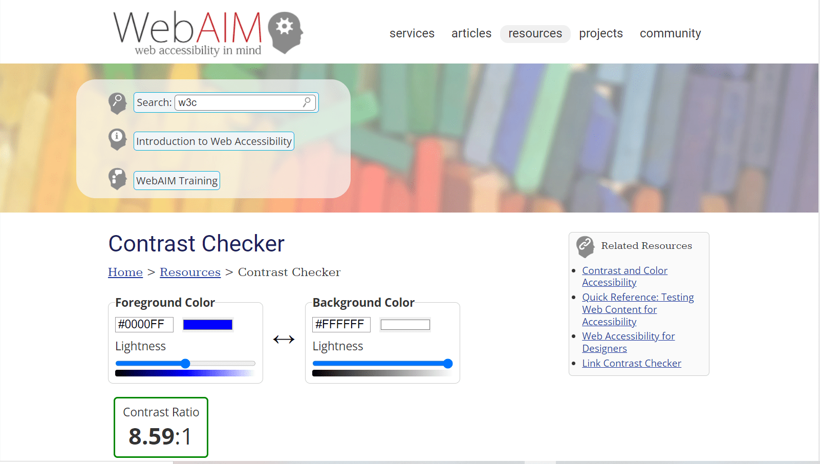
Make sure there is adequate contrast between the background and foreground colors while designing. WCAG recommends a minimum contrast ratio of 4.5:1 for text and images and at least 3:1 for large text and images.
:
If you are unsure about contrast ratio or color schemes, fret not, I have got you covered. Here is my favorite tool to check color contrast on websites.
Images
Users with vision impairments have difficulties understanding the information if it is conveyed only through images. The WCAG recommends organizations or developers provide an alternative to images known as Alt-text.
Alt-text is a brief summary of the information conveyed through the image. The alt-text provided must be precise and convey all the relevant information to users. If the image used is purely for decorative purposes, then mark the image as decorative.

Here is an example of how to write alt-text for the above image
Bad Alt-text: Tiger sleeping on a sidewalk
Good Alt-text: A dog lying on the sidewalk in front of a gate with the striped shadow of the rails falling on its back, making it appear as a tiger
Videos
Videos on the website should include captions so that it is easier for people with hearing impairments to easily understand the content. Furthermore, you can also provide an extended text description if the captions in the video are insufficient to convey the information.
Avoid using gifs or animations that have flashing lights or contrasting light and dark patterns that might trigger photosensitive epilepsy.
Tip: You can generate free captions for your videos by using websites like Youtube, Descript, etc.
Forms and labels
In order to help individuals fill out forms quickly, the usage of placeholder text is very common. Unfortunately, if placeholders are used entirely to designate form fields, it causes three issues.
- Due to the poor or low color contrast, people with low vision may not be able to notice the placeholders as clearly as sighted users.
- The keyboard is typically used by screen reader users to traverse the form fields. The screen reader will not announce the field requiring user input if the <label> tag is missing from the form field.
- The tab order should be such that keyboard navigation is simple and that each field important to completing the form has labels.
Links
Many websites use links to guide users to a different web page or to provide sources of the acclaimed fact. Since links guide users to a different page, it might cause panic among users, especially people with vision impairments if they are not notified. Here is how you can make links accessible:
- Notify users about the link’s destination so that they won’t panic if it is an accidental activation.
- Avoid using words like “click here,” “read more,” etc., as they don’t make sense when read out of context.
- Make sure that the links are accurate and descriptive so that users can easily understand the purpose behind the links.
For example, say you want to redirect your visitors to the Amazon website
Bad way to write links: To learn more about the product click here.
Good way to write links: To learn more about the product visit the Amazon website
Best free web accessibility testing tools

Accessibility testing ensures that a website is user-friendly for everyone, including people with disabilities. A testing tool is your guardian angel that can conduct extensive testing and generate comprehensive reports that update you on the current accessibility status of the website.
WAVE
WAVE is a free accessibility evaluation tool developed by WebAIM.org that aids in the creating accessible content on websites. WAVE analyzes and matches content against the WCAG guidelines and provides you with a comprehensive visual report that contains all the accessibility violations.
Cynthia Says
The next one on the list is Cynthia Says, fun fact, Cynthia was developed to raise more awareness about web accessibility testing and its importance. The tool allows you to check the accessibility of every page and provides detailed feedback about the accessibility errors present on the pages.
Accessibility Checker by CKSource
The Accessibility Checker is extremely flexible and has one of the most user-friendly UI. It will assist you in inspecting all the compliance errors on the page and also can fix common accessibility issues with its “Quick Fix” function.
LERA
LERA is an automated web accessibility testing and reporting tool that provides you with a detailed report of your website’s accessibility issues. It can evaluate websites based on the WCAG 2.1 accessibility guidelines to identify the violations and suggest potential fixes.
LERA is the only fully automated web accessibility extension that provides both Accessibility Audits and Accessibility Reports for free.
There are many more tools available online that are free as well paid. Although these tools can recognize many accessibility issues, one must understand that the tools can only find up to 20% of accessibility errors. Organizations should try to have an in-house accessibility expert or outsource it to others to be on track towards the path of maximum accessibility.
Accessible website examples to inspire you
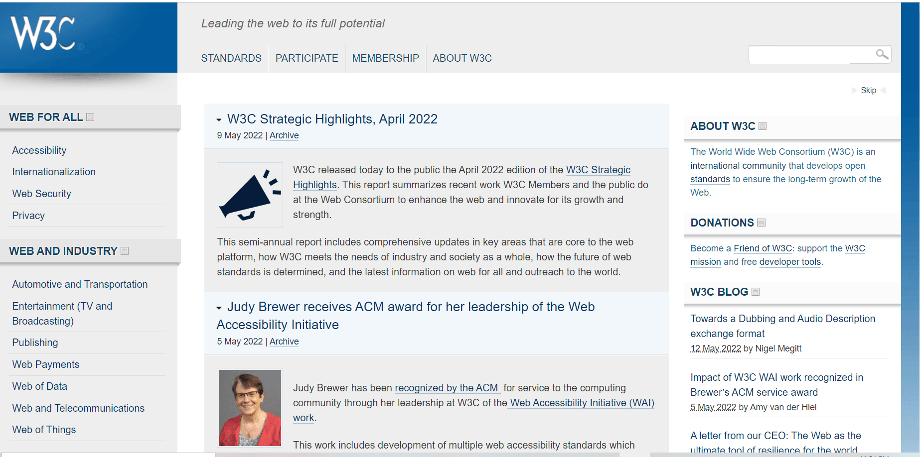
First, the W3C.
Can you imagine Domino’s not selling pizzas?
Exactly! It would be ironic if the community that developed the WCAG guidelines did not follow them. W3C is the greatest example of an accessible website. It also contains web accessibility guidelines and best practices that guide other websites to become more accessible.
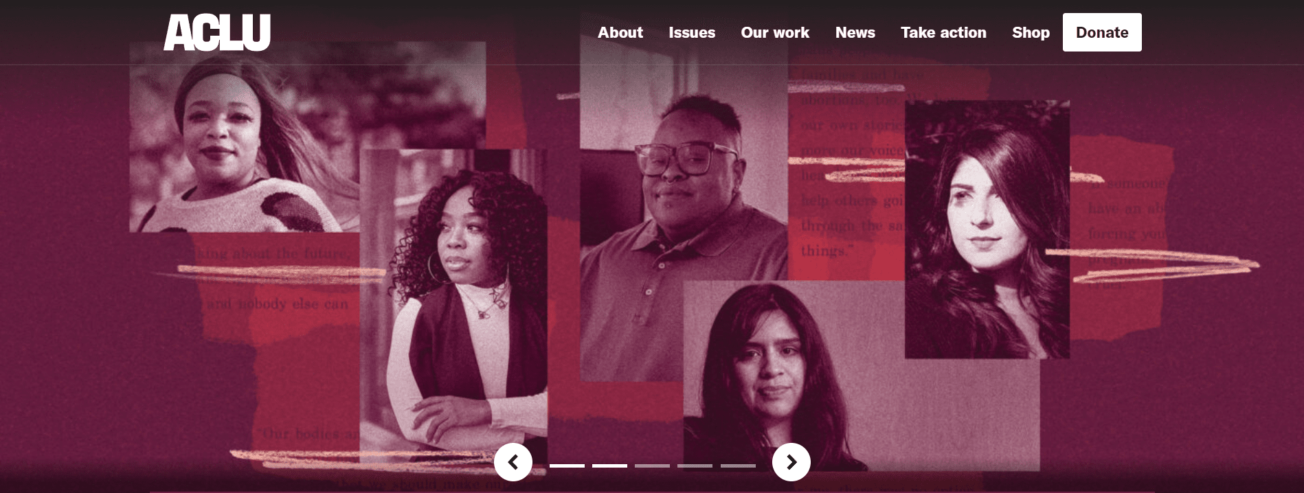
According to Wikipedia, the American Civil Liberties Union (ACLU) is a nonprofit organization founded in 1920 “to defend and preserve the individual rights and liberties guaranteed to every person in this country by the Constitution and laws of the United States.
In short, ACLU fights to preserve the rights of individuals as guaranteed by the Constitution and also files cases against discrimination of oppressed groups.
The ACLU website carefully uses structural elements such as headings, lists, header and footer, and navigational elements and ensures it is accessible to all users. It also provides an option to turn off the autoplay of the image slideshow and much more.
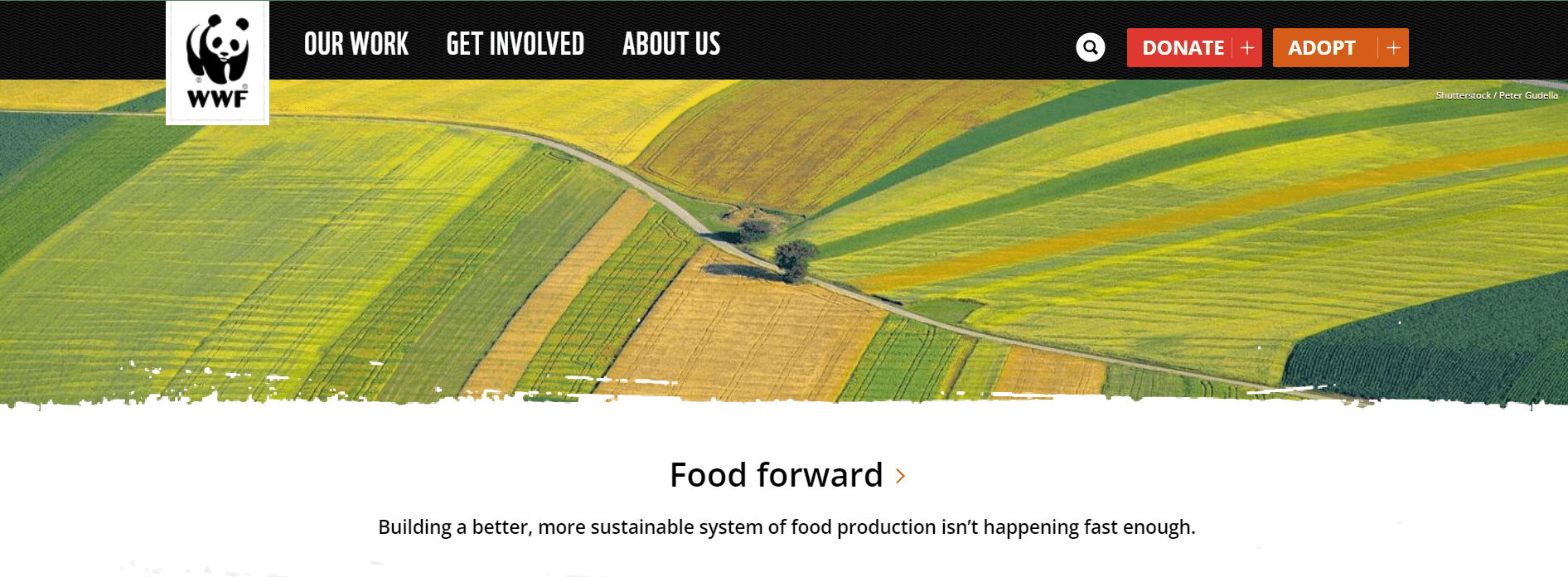
The World Wildlife Fund or WWF conveys all the information such as its mission, initiatives, educational content, etc., in an accessible way. It also does not overload its web pages with content, which extremely benefits, the navigation and, in turn, boosts accessibility.
The world is constantly changing, and people depend on technology now more than ever. Therefore, it is essential for organizations to create web or mobile applications that offer more support to users with disabilities.
The ultimate guide to web accessibility
Think about it, how would you feel if there was an office chat group with everyone except you? It would make you feel bad, right? Furthermore, having an accessible digital application will help you avoid legal penalties. Lastly, make sure that your services are accessible to everyone regardless of their disabilities; it will not only boost the confidence of disabled people but also help them have a better quality of life.
The post The ultimate guide to web accessibility appeared first on Simple Talk.